George Harrison

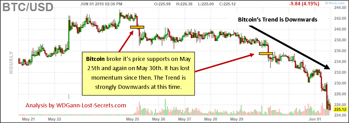
Bitcoin’s Decline
Bitcoin has been in a down trending retreat for some time now.
 The long-term chart for Bitcoin above shows that the down trending price pressure has been relentless and consistent in it’s retreat from the highs.
Lately, there have been some additional, shorter-term signals indicating further declines ahead.
CLICK CHART TO ENLARGE
Particularly May 25th and on May 30th. After the May 30th price support (both support points are shown by the golden colored horizontal bars) was broken, the slide in price accelerated lower.
Together with the long-term outlook and the short-term trend, the present prognosis for Bitcoin is for lower prices to continue. – George
APPLE Stock Analysis
[private_GANN TRADING GROUP]We now turn to a price chart analysis of APPLE computer stock (symbol: AAPL).
APPLE is a unique stock in many ways and it’s price strength is one. It’s presently at it’s historical price strength and the trend is upwards.

CLICK CHART TO ENLARGE
Presently, AAPL is in a sideways moving market mode. This itself means that the momentum is slowing and we’re wedging into a time period when we’ll either continue the previous uptrend or break the present up trend and move trend to the downside instead.
APPLE is such a powerful part of the US Stock Market that, should it stumble and fall downwards, then, surely the rest of the index would be likely to follow as this would be bad news for the economy. This being the case then, we should carefully watch this particular stock to gauge the strength or weakness of the overall market.
There are two important pivot points to watch for these events.
The first important pivot point to watch is the 135.00 Resistance price to the upside (should daily prices close above this price it would indicate a BULLISH Buying point and a renewal of the strong up trending market).
The second important pivot point to watch will be the Bearish Support price of 122.50.
Should daily prices close below the 122.50 pivot price (and, especially should the entire daily range be below this price), we’ll have a very strong indication of a break to the downside in trend. – George
[/private_GANN TRADING GROUP]
TESLA Stock Analysis
[private_GANN TRADING GROUP]We’ll now turn our eyes and interests to the hotter stocks in the US Stock Market beginning with TESLA (symbol TSLA).
TESLA has been on strong upswing this month and as of Friday we find the stock priced near it’s highs and in a strong position.
Let’s look at the price chart for TSLA to see just where we are and where we’re coming from this month:

CLICK CHART TO ENLARGE
The present support price area to watch is at 244.00. If prices pull back below this price level on an hourly basis, this will be a strong indicator that a downward trend is starting.
If price is strong enough to break above the triple top at the 251.00 area, we can expect prices to advance to 258.00 before encountering resistance and a possible pullback from there. – George
[/private_GANN TRADING GROUP]USD/CAD Weakening
[private_GANN TRADING GROUP]The USD/CAD forex pair has altered it’s upward momentum due to a weakening US Dollar.
The price to watch for further confirmation of a change in trend to downwards will be 1.24.

CLICK CHART TO ENLARGE
If closing prices for the hourly bars go below this price level and, especially if an entire hourly bar’s range is below 1.24, then this will be a very strong indication of a change in trend to the downside has begun. If so, then it will likely last for weeks.
This is a shorter-term analysis for shorter moves and not a mega-trend in the USD/CAD. – George
[/private_GANN TRADING GROUP]The US Dollar, Euro & GBP
The US Dollar remains strong still, even as the Euro has flirted with a price pivot area as described in yesterday’s post.

CLICK CHART TO ENLARGE
The present upswing was detected early as shown by the green circle at the 94.00 price area.
With an upside target at 99.00 (the red rectangle above the present prices) still open as a possibility and a support price level at 96.00 (represented by the orange rectangle below the present price action), we find the present US Dollar prices are poised right in the middle of these two action points.
Combine this information along with yesterday’s post showing the EUR/USD testing it’s resistance price points at 1.10 and we have some seemingly contradictory information.
CLICK CHART TO ENLARGE
The Euro and the US Dollar are a forex pair and so, must move opposite to each other on the charts.
To attempt to make sense of the markets at the moment, the fact that we see the Dollar mid-way in a rising trend and, not really all that close to testing the limits of it’s present trend direction, provides us with a valuable clue.
It seems that of the two currencies, the Euro is currently the stronger near the top of it’s range and that the US Dollar may be sputtering out from it’s driving uptrend.
To further this conclusion, let’s look at another forex pair containing the Euro and see how that measures out.
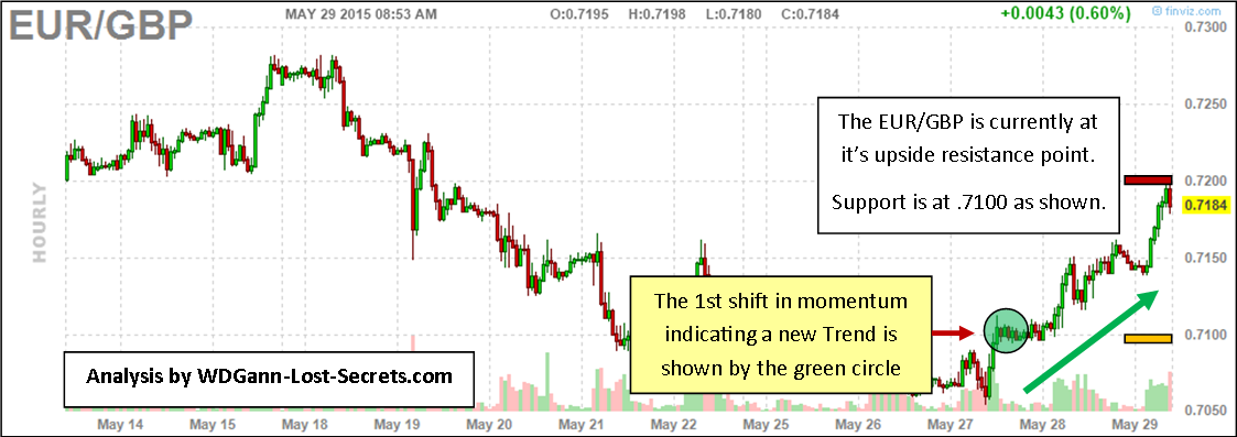
Let’s look at the EUR/GBP:
CLICK CHART TO ENLARGE
Here, we again see strength and a market up against it’s resistance price area (shown by the red bar above the price action).
However, the Daily trend has already turned upwards for the EUR/GBP while it hasn’t turned upwards for the EUR/USD yet. This implies that the EUR/GBP may well be the lead forex pair for the next leg upwards for the majors (excluding the US Dollar).
Price resistance points in an uptrend (tops) usually provide market makers with SELLING opportunities which drive the price into a pullback before attempting the next surge upwards.
But, at the point where complete price bars of sufficient time period (like the 1-hour bars on the charts) are able to break through the resistance points and go to new highs, strategy favors a BUYING STRATEGY rather than the usual market makers bracket plays. – George
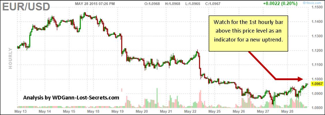
The Next Euro Swing?
We’re presently close to a critical short-term pivot point for the Euro which may provide the impulse to begin a new swing to the upside again.
Prices have bottomed and are approaching the important 1.10 level. As you can see on the chart below, the arrow shows the price area to be watching closely.
 What will confirm this price crossing as ‘authentic’ and highly probable will be if an hourly bar closes above the 1.10 price level. Shorter spikes won’t provide enough momentum to start an uptrend that will last. – George
FOREX: Shifting Trends
The FOREX currencies are markets that rest on the shifting grounds of TREND.
If you have an opinion on the currencies that’s more than a few week’s old, you’d better ditch that opinion and, instead favor the Reality described by the price charts themselves.
Generally, everyone has become comfortable with rising foreign currencies and a falling dollar. It took a while to make that shift, but, now most are ‘on board’ with this as the ‘norm’.
It looked like these charts. Note the colored blocks indicating the trends going into May.
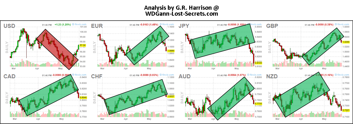
BEFORE: The dominant trends going into May for the Currencies.CLICK CHART TO ENLARGE
These trends were clearly up (excepting the US Dollar) for over a month running going into May..
However, just as enough time set in to assume a new direction as being ‘established’, every one of these major Forex currencies shifted.
Some, like the New Zealand Dollar, led the break to the downside.
The stronger of the currencies like the Canadian Dollar (CAD) and Swiss Franc (CHF) held their trends longer and have only just broken down.
THE PRESENT STATE OF CURRENCY TRENDS
The chart below shows the trends that are presently in progress for the Currencies.

THE PRESENT CURRENCY TRENDS. CLICK CHART TO ENLARGE.
The US Dollar has now started back up again, while ALL the other majors are in a downswing. Keep this in mind even when trading on a daily basis as this momentum will assert itself over the course of daily price moves. – George
The Strategic Game of Crude Oil
As we take a closer look at the Strategic Game of Crude Oil Trading, we’ll also continue our exploration of the process of deception in market pricing being the normal mode of behavior for the market makers.
First, the Crude Oil market is examined below:

CLICK CHART TO ENLARGE
The recent low was constructed to make us believe that prices would continue to flow downwards.
Instead, we saw prices rise.
Once those prices took out the 3-month highs, we started to enter a new price paradigm; one which allows for the probability that prices will rise again.
To confirm this possibility more solidly, we’ll need to see prices rising above $65 and holding above that level.
Until then, we must assume that we’re in a moderate, sideways market price zone with a slight bias to the upside.
This is a long-term projection of course. If prices can break the upside resistance bar shown on the chart, we’ll be back in a strong bull market for Crude Oil again.
Before a strong bull market will manifest, expect new lows to be established first. This is the way that the market makers clear the decks of buyers, whom they view as competitors. (Remember our previous post where we recited their sacred Commandment: “Competition is a Sin”). – George
Market Game Strategy
The Markets are an intensive game arena and, all games have rules and need strategy to win.
The Rules of the Markets favor the Game Masters (those who run the game) and, one of the greatest strategies they use to win is to apply ‘deception’ at critical price points in order to mislead and reduce competition on the ‘right side’ of a market trend.
The reasoning behind these deceptive strategies are straightforward enough and are well embedded into the psyche of the markets.
Their History?
To restate the ‘Greed is Good’ mantra (from ‘Wall Street’, the movie) in it’s older, original form as a bedrock belief system of John D. Rockefeller: “Competition is a Sin”.
You, my fellow investor, are the competition in the eyes of the market makers (who firmly believe the above as Commandments).
 Knowing that, then, it behooves one to be aware that certain strategies will be used against us as outside investors participating on their Game board.
Accept that fact as the ‘norm’ of the market maker’s behavior and expect to see these strategies manifest themselves on our price charts as part of the Grand Game Strategy.
Forewarned is forearmed.
We’ll be exploring and revealing these strategic points in the coming posts starting with Crude Oil. – George
Chinese Stocks and the Art of War
From the Chinese Stock Market and the book, ‘The Art of War’ (written by Sun Tsu), we learn a valuable principle to be applied to all investing: “All War is Based Upon Deception”.
The markets and their behavior these days leave no doubt that a war is being waged upon average investors. Even institutions battle with each other and scheme to move markets to trap their competitors or throw them off-balance at any opportunity.
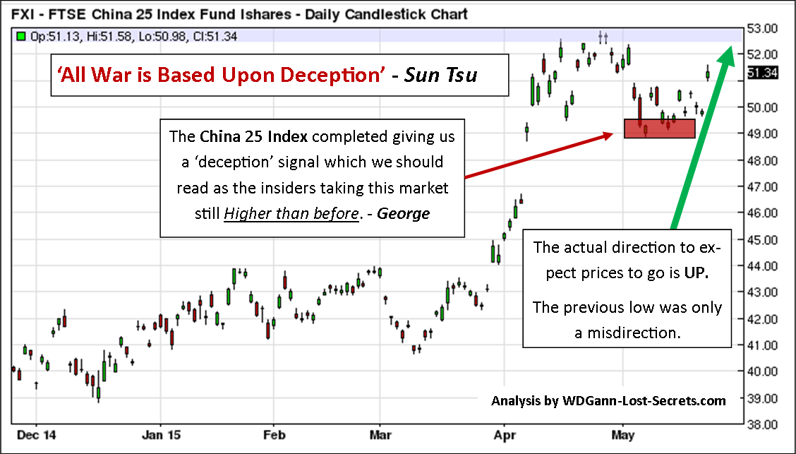 The China 25 Stock Index has recently completed a nearly perfect act of deception by making some white-knuckle lower lows which led one to ‘believe’ (intentional deception) that a ‘crash’ was imminent.
This was accompanied by numerous, so-called ‘news’ articles maligning China’s Economy and it’s weakness. However, this was pure public relations propaganda.
The chart to the left shows the likely real story. The price deception area is shown in the red rectangle and fooled many a trader and investor.
The intention of this deception is to have traders stand aside in fear and inaction while they take the market still higher. By the way, the etf for this market has the symbol of FXI.
There’s a counter-deception that one must be watchful for as well and, that’s one which will try to simulate a strong market before driving it further downwards. To tell the difference, one needs to observe the prevailing public opinion (which is programmed at great cost by market makers).
The prevailing present news is negative for the Chinese Stock Market, even mocking of anyone who is in this market.
That’s strong confirmation for a market that’s going higher and in favor of the first opinion given in this article. – George
The Chinese Stock Meltdown
PREDICTING THE ‘CHINA H SHARES’ MARKET BREAK
Last week’s break in the China H Shares Market caught most by surprise and shock.
The meltdown of the market with it’s plunging prices was quick but presented a high profit potential for those who could anticipate and exit their long positions or sell into this falling market.
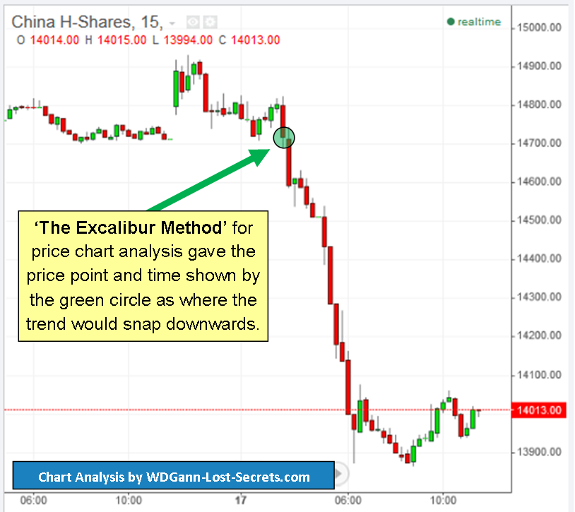
The fundamentals will be debated as to ‘why’ this happened, but, it’s been my mission on this website to deal with the ‘WHEN it will happen’ question.
To do this effectively requires very special tools and knowledge.
The Excalibur Method has remained a reliable tool of analysis to answer the question of ‘WHEN’ for years now (on both this website and our earlier www.money-tigers.com website).
As you can see on the 15-minute chart for China H-Shares, Excalibur found a weak, balance pivot-point where both Price and Time were most vulnerable to a momentum ‘push’.
And, that’s just what happened.
This form of analysis must be accurate and not time dependent to be of most use to traders and investors.
In other words, the time frame for the bars or candlesticks, whether 5-minutes or 1-hour shouldn’t alter our results as what we’re pursuing is a fundamental mathematical truth and not a subjective one.
As long as our time periods are natural ones based on natural law, our conclusions should be valid.
In other words, we may state with confidence that, when it comes to price charts that:
 Truth holds at all time levels.
To the left is the very same China H-Shares market but with one-hour bars instead of 15-minute ones as in the previous chart.
The results of the analysis are the same.
The same time and price pivot point was obtained, and, in advance of the market reaching it!
This is just the latest example out of hundreds these last 5 years.
The volatile times we’re in now really require an extra edge when it comes to analysis and knowing IN ADVANCE where critical price points are located.
I encourage those who seek to thrive in these markets to consider The Excalibur Method. This method of determining optimum investment and exit times for the markets will set you on a new and most satisfying trading path of success.
For a limited time, those who purchase The Excalibur Method will receive a valuable and very special additional technique that will multiply your market insights immensely!
To learn more, you’ll need to inquire by e-mail by clicking here.
Thank you for taking the time to read this post. We’ll be examining some other exciting markets in the days ahead. – George
Crude Oil Price Momentum Shifting Upwards
CRUDE OIL PRICE MOMENTUM SHIFTING UPWARDS
First by Daily momentum increments, then by Weekly and now by Monthly momentum, CRUDE OIL is shifting it’s price objectives upwards.
We’re now at the very earliest level of a monthly shift in price. This is a very significant clue to a bottom in Crude Oil prices for possibly many weeks to come.
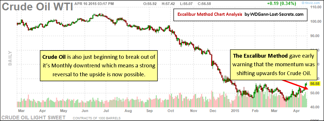
Click on chart to enlarge for increased clarity
Crude Oil Prices declined for 9-months, so, it’s safe to assume that any reaction to that decline is likely to last weeks, at least, and, more likely months. This means that oil prices can rise going forward for some time if confirmed by price momentum.
Early indications are now in using The Excalibur Analysis Method that, indeed, a significant shift has started to take place.
Prices need to have the strength to hold at present levels (or higher) for the next 2-weeks time for the new uptrend to provide confirmation of the strength of the upwards move to follow.
Long trades can be made before this time, but, only on retracements in price above previous lows and, with stops placed just below the previous low swing.- George
Crude Oil Locks into Sideways Trend
CRUDE OIL LOCKED INTO FAMILIAR SIDEWAYS PATTERN
Crude Oil pricing trends have taken a pause.
We’re now experiencing a round-robin Buy/Sell scenario within a well-defined range matching the one before the last major price decline.
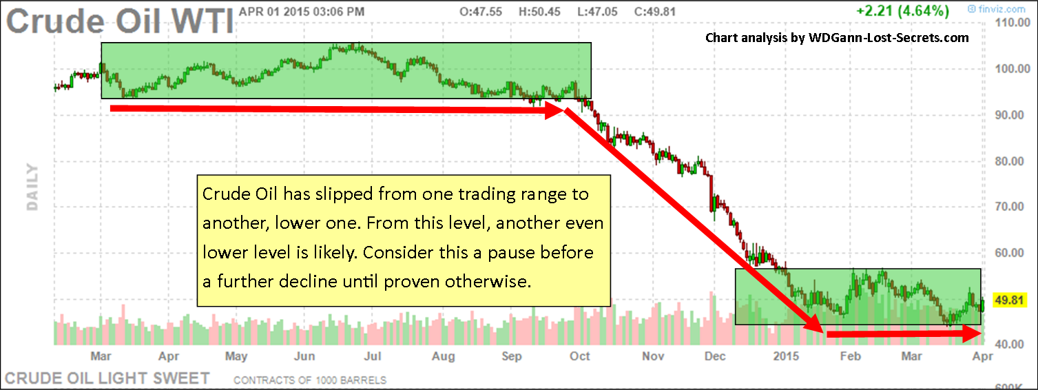 Once we become aware of the pattern, we’ll be better equipped to take advantage of it.
Sideways trends of choppy price movements are actually the ‘norm’ and not the exception.
Fully 80% or more of price action can consist of such price oscillations.
These become the classic Buy/Sell Zones of the professionals who will Sell the top of the price zones (shown in green on the chart) and Buy the bottoms of the zones to exit or enter the trades again.
It’s expected that the decline that followed this sideways pattern before, will happen again in the future. Until that signal is given though, the sideways trend remains intact. – George