George Harrison

What’s Gold Up To? Going Beyond the News
GOLD’S IN THE NEWS AGAIN. WHAT’S IT MEAN?
Word is out that Gold’s on the rise again and that the Bear market in Gold has ended.
Who says so? Why the media experts and, of course, the gold dealers who are perennially long the metal.
If you look at the short-term clipped charts offered to back this in the news, they look like this:
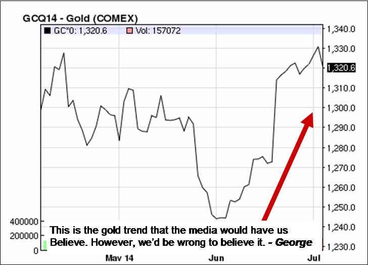
As mentioned in the previous post, the media’s job is to mislead so as to benefit the big players in the markets.
If we fall for this small selected piece of gold price history we’d be falling into a trap and we could be seriously mislead as to the future of this precious metal.
The chart to the left is unbalanced in it’s presentation to traders and investors and, is yet another example of an attempt to place investors on the wrong side of a major market move. In this case, GOLD.
Yes, some profits have been possible short-term on the long side but, is this a market that promises a great deal more upside?
Let’s take a look at a longer time period for prices in this market and discover what so many don’t want you to discover.
And, what is that? Simply this, the Gold market is STILL IN A SERIOUS DOWNTREND on a long-term basis and IN A SIDEWAYS MARKET on the medium-term.
Take a look at the next chart for proof:
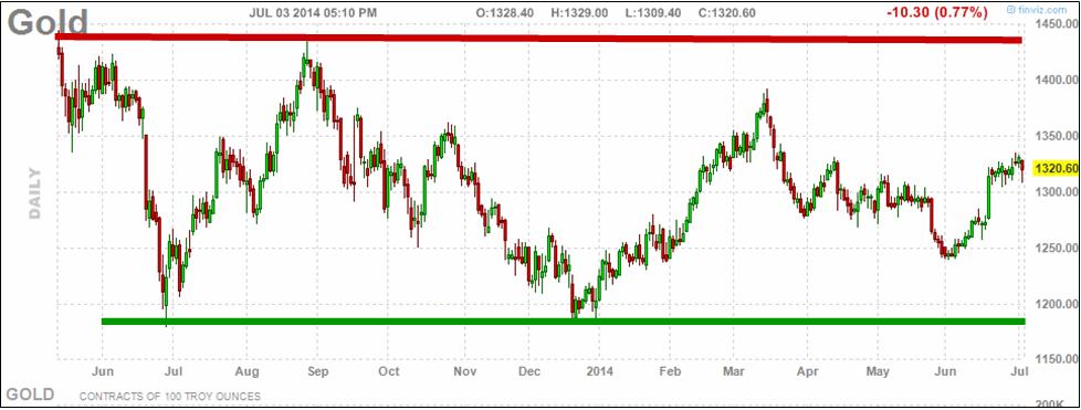
THIS IS WHAT GOLD LOOKS LIKE WHEN WE
STEP BACK A LITTLE TO GAIN THE PERSPECTIVE OF TIME. – George
This chart clearly shows that we’ve been locked into a sideways market for almost 2-years now.
Prices are only at the middle of their range at present, so, they can still go higher while not indicating a new Bull Market at all!
In order to work this sideways range you’ll need a tool that can protect you from too many whipsaw plays
(like that used on this site).
This website’s intention has always been educational and the design of the methods used to analyze the markets has always protective of the trader and investor. To do that I’ve had to discover and re-discover (in Mr. Gann’s case) the fundamental laws of the markets and their structure. By doing so and analyzing markets with these tools, a more stable and reliable result can be found. One that inspires growing confidence with use.
The results speak for themselves as the archives will show and my mission has been to teach the principles and methods that will allow you to do the same for your own interests and investments.
If you want to know more, take the time to click the banner below and send me an e-mail requesting price and regional availability. Thanks. – George

![]()
The Financial Media is Not On Your Side
Day-after-day, week-after-week it goes on without end; I’m referring to the financial media’s selling of a market ‘viewpoint’ that’s at odds with Reality. The populace is far too wowed by and in deference to ‘authority’ figures on television, radio and print media than is financially healthy for their own good.
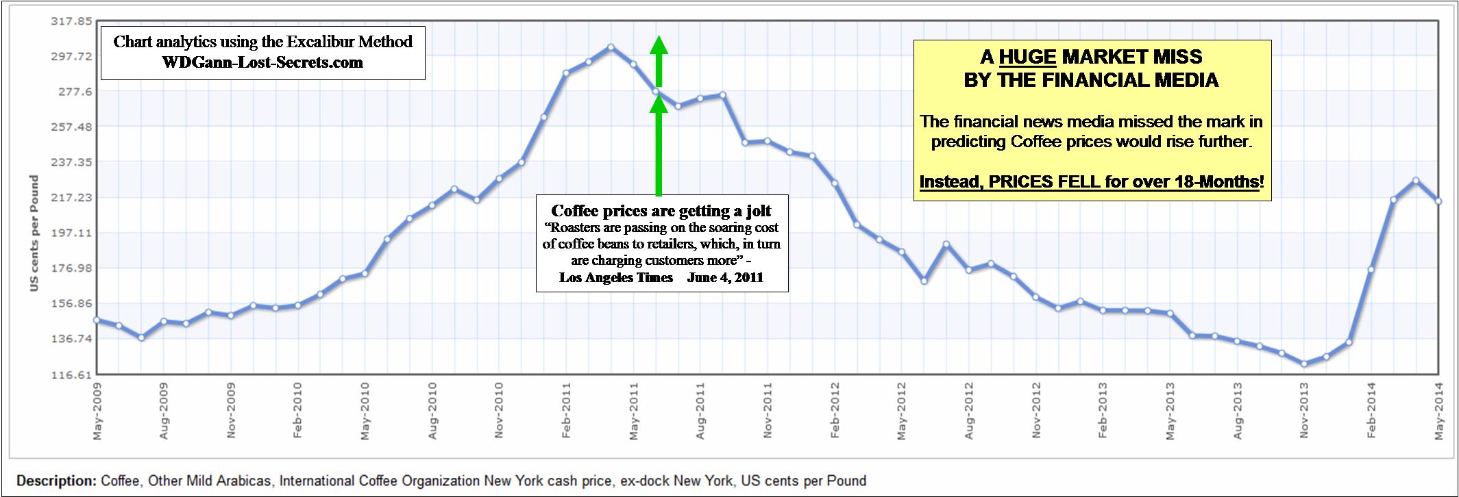
CLICK Chart to enlarge and clarify
Make no mistake, these financial outlets are actually ‘non-authorities’ as to where the profits are to be found in the markets. Instead, they’re actually public relations outlets whose main editorial content is aimed at placing investors on the opposite side of the real market trends.
The chart above is another example of an attempt to place investors on the wrong side of a major market move. In this case, COFFEE.
The implication of the report that said “Coffee prices are getting a jolt.” was that prices were continuing to rise and would rise even more into the future. Well, they didn’t.
Instead, the time picked by this widely followed financial media outlet for the ‘old’ uptrend to be over, actually ended up pinpointing what became the beginning of a major shift downwards and the absolute worst point at which to BUY and enter the Coffee market.
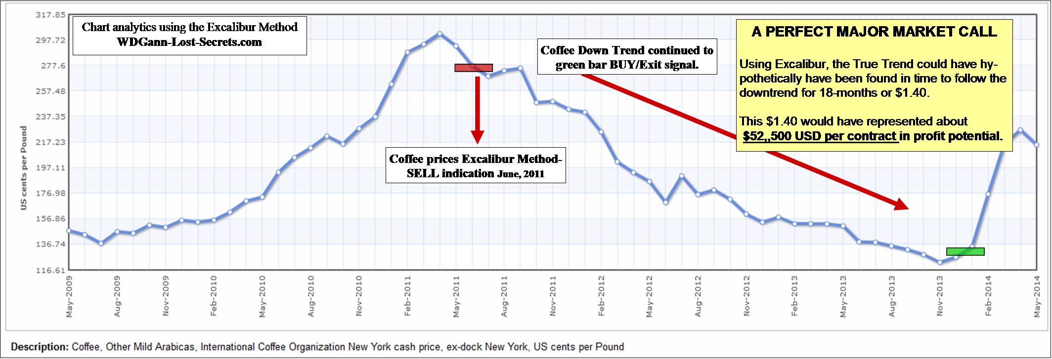
CLICK ON CHART to enlarge.
The chart above shows how one analytical method (the Excalibur Method) assessed this same market.
The media saw a BUYING OPPORTUNITY instead of a selling point and could not distinguish that the important trend had now shifted downwards with plenty of low-side potential ahead.
The market dropped by $1.40 DOWNWARDS from where the media’s suggested prices were going higher.
This was a hypothetical profit potential of $52,500 per futures contract.
This is just one example and I’ve seen many, many more over the decades of research into the markets where the popular media got it completely wrong.
In fact, the inaccuracy of the media is far too spot-on to be coincidental. It’s far from the 50-50 right/wrong expectations of a random guess. Very far from it. Think about what that means at a deeper level for a moment.
In fact, the financial media can be used as a counter-confirmation tool to a sound analysis method (like that used on this site). In short, recognize the financial talking heads for what they are: touts for big-money vested market interests.
This website’s intention and the design of the methods used to analyze the markets has always been to protect the trader and investor from ‘surprises’ in the markets. To do that I’ve had to discover and re-discover (in Mr. Gann’s case) the fundamental laws of the markets and their structure. By doing so and analyzing markets with these tools a more stable and reliable result can be found. One that inspires growing confidence with use.
The results speak for themselves as the archives will show and my mission has been to teach the principles and methods that will allow you to do the same for your own interests and investments.
This knowledge will often guide you to advocate unpopular and seemingly contrary positions to those advocated by, among others, the financial media, but, the Truth requires nothing less from us.
If you want to know more, take the time to click the banner below and send me an e-mail requesting price and regional availability. Thanks. – George
![]()
Market Chaos or Natural Cycles?
[svpVideo v=1]
Crude Oil Profit Opportunities
CRUDE OIL PROFIT OPPORTUNITIES:
WHAT MOST TRADERS HAVE MISSED & WHAT LIES AHEAD
To read the Article and view the Charts; click on the chart below:

CLICK ON CHART TO VIEW MEMBER’S PAGE
JOIN TODAY TO VIEW ARTICLES AND CHARTS

![]()
Back to Nature: The Seasonal Waves of Opportunity
THE SEASONAL OPPORTUNITIES IN GRAINS
NOTE: All the chart positions shown are hypothetical and for educational purposes only.

![]()
Let Your Price Charts Pick the Opportunities – Not the ‘News’!
THE MEDIA: EVERYTHING OLD IS ‘NEWS’ AGAIN
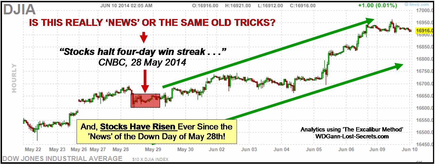
To read the article and view the charts, click on the chart above.
Now would be an excellent time to join our subscriber group.
Thanks. – George
![]()
The Great Bull Market Confirmation
S&P 500: BULL MARKET CONFIRMATION
By G. R. Harrison (2014)
 Question: “What is one of the fundamental characteristics of a Great Bull Market when it starts?”
Answer: The Public’s absolute refusal to believe it!
This has been a constant rule throughout stock market history and is happening today again.
Check it out for yourself.
What’s the attitude of the ‘experts’ on the various media platforms; are they positive or negative on the market?
If you’re reading and listening to the same sources I am, then you know that they’re by-and-large awaiting a technical ‘pull-back’ in the market.
Some even expect a panic sell-off or an outright crash. Someday these events will happen, of course, but not today or next week according to these charts.
This is an error caused by too short a time perspective and a misunderstanding of the power of market momentum built up over a long period of time.
Take a look now at the chart above.
It covers a 25-year period of history for the S&P 500. More importantly, this chart shows that today’s stock market as represented by the S&P has broken out of a 13-Year sideways trend and taken out a double-top.
Both of the previous stock market tops were historic highs for their time periods (2000 and 2007).
We’ve now exceeded them both and the angle of ascent is strong. There’s a great deal of built-up momentum for this move and it’s strength isn’t believed by the masses of average investors.
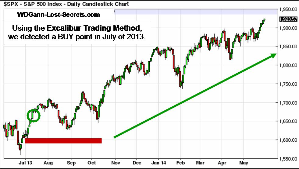 This website pointed out this strong market move back in July of 2013 when we predicted that the market was strong and headed higher.
How could this be done so early on into the move?
Well, it takes a ‘guidance’ instrument that can see past the headlines and gossip.
One that’s based on natural law instead of discredited man-made economic theories or technical indicators used by millions of other traders.
To stand apart from other traders, I recommend ‘the Excalibur Method’ as that ‘guidance’ instrument to all my clients.
You can find out more by clicking HERE. – George

The rediscovery of these WD Gann lost secrets (and many more) as well as other completely original discoveries are available to a limited number of students each year through The Harrison-Gann Trade Secrets Master Course. Contact me by e-mail for price and availability by clicking the box above.
![]()
Japanese Nikkei Downtrend
JAPANESE NIKKEI 225 DOWNTREND CONTINUES
By G. R. Harrison (2014)
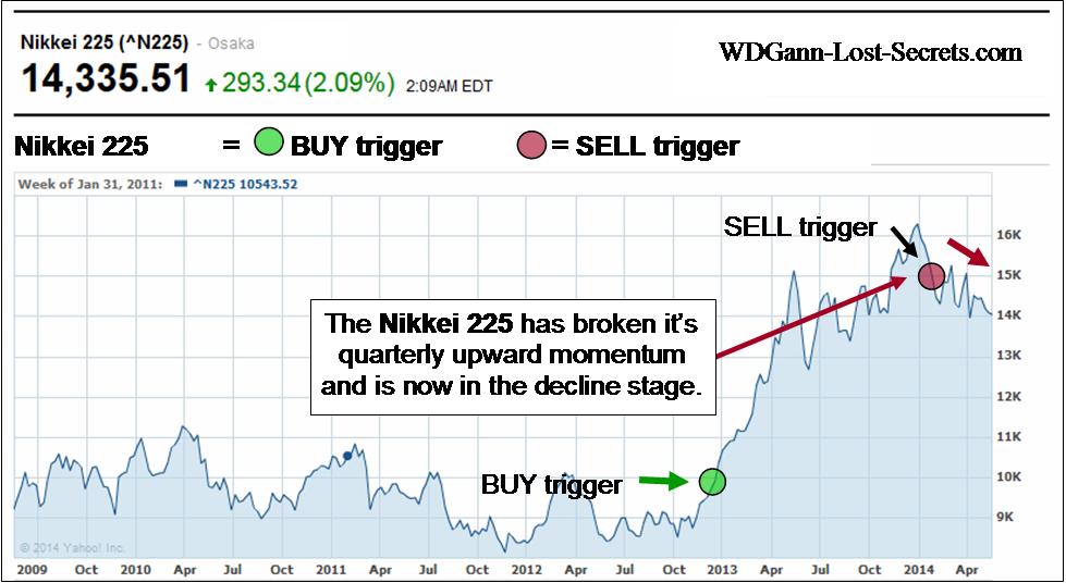 Today, we’ll take a quick look at the Japanese Stock Market as represented by the Nikkei 225 Index.
Unlike the other World Markets, the Nikkei shows a market that made an incredible surge upwards but which has now peaked and is falling in a downtrend.
This is a major economy and a major market break which has not been recognized as such yet.
At the very best, the momentum has broken to sideways and run out of steam completely.
But, this is a market which, (like a Judo Sensei) has had considerable practice in how to take ‘Fall’.
Remember, the Nikkei 225 once peaked at 38,957 in December 29th of 1989, so, this is a market that has fallen from a great height.
And, it may not have reached Bottom yet.
This could turn into a runaway Bear market seeking out it’s ‘comfort’ zone back in the 8K-10K price area before exploring even lower levels, in which case we’ve just seen the first ‘bounce’ up from the 8K price area. We may be on the second arc downwards at present. If we break the 14K price level and go down again, we’ll have an even stronger case in favor of the downtrend. – George
NOTE: The Excalibur Method was used on these charts and, all charts show hypothetical decision points as part of this website’s educational content. All trading is risky. Please read the Disclaimers on this site.
THE EXCALIBUR TRADING METHOD

CLICK HERE TO LEARN MORE
This is the method that I developed in order to find the true ‘intentions’ of the institutional traders in every market.
This approach is unique and, is not a conventional trend tool. The theory behind this exceptional analytical tool was derived from my many decades of research into W.D. Gann’s methods and writings as well as those of the ‘mercantile principles’ from the business side of the markets.
As the years rolled by, rediscoveries of lost principles of the markets were accumulated into what is now called the ‘Harrison-Gann Trade Secrets Master Course’.
‘The Excalibur Method’ is now part of the Master Course but, still may be purchased separately for a little while longer. You can read testimonials here.
The first half of the manual introduces a new paradigm and perspective for identifying what I call the ‘intentions’ or ‘objectives’ of the big market interests who clearly control the market trends. The Excalibur Method’s purpose is to allow one to place themselves in alignment with the plans of those who make the markets by using a mathematical tool to extract and interpret those plans. This information is a restricted release product. E-mail me HERE for price & availability
The rediscovery of these WD Gann lost secrets (and many more) as well as other completely original discoveries are available to a limited number of students each year through The Harrison-Gann Trade Secrets Master Course. Contact me by e-mail for price and availability by clicking the box above.
![]()
India Rising
INDIA: IT’S MARKETS & ECONOMY ON THE RISE
By G. R. Harrison (2014)
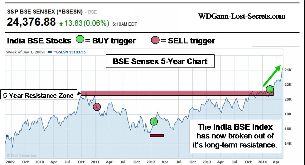 INDIA is the next of the BRIC (Brazil, Russia, India and China) nations we’ll examine.
What we’ve been looking for are signs on how the stock market and currencies for several nations.
Most importantly, we’re drawing our conclusions directly from charts that pertain to a nation’s stock market and it’s currency.
Unlike some of the recent nations we’ve analyzed, India is going it’s own way independently from the other BRIC nations.
The Indian Bombay Stock Exchange bottomed at the end of 2012 and has been rising ever since gaining over 50% in value over that time to present.
More importantly, this rise in the BSE Sensex index appears to be ONLY JUST BEGINNING.
The first chart shows the index for the last 5-years along with trigger signals and the Resistance ceiling for prices over this long period. Prices have now broken well past this former resistance level and soared upwards. When prices are contained within a range for a long period, a break-out will have considerable momentum behind it.
That’s the case here. But, it gets even better . . .
 The next chart shows the BSE Sensex Index over a 10-Year period.
This is a very long time period for markets.
Note that the horizontal red bar shows how price resistance has been contained over this long 10-year period by the 20,000 price area.
Also notice that we’ve now blown by this in the upwards direction.
History and the study of price movements (as WD Gann always advocated) shows that such price breakouts often have preceded enormous market moves in price.
Looking around the World, this market seems to offer tremendous promise for growth and prosperity.
Let’s see how India’s currency is poised during this Stock Market & economic boom.
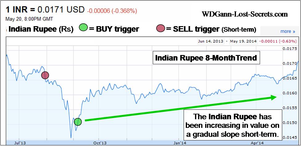 On a monthly basis, the Indian Rupee is rising in a steady, balanced fashion.
This is an important clue because, a solid, long-term rise needs to have a solid base price region.
This is best established by a slow, steady building of value (in India’s currency the Rupee in this case).
Should this process continue we’ll have the excellent pairing of a strong stock market backed by a strong currency.
This is a short-term rise from, what has been, a constant decline in the Rupee lasting 2- years now.
All downtrends, eventually turn into uptrends again.
Has the Indian Rupee made this turn?
Let’s look back a little bit further into the past to put this currency (and India’s economy) into better perspective.
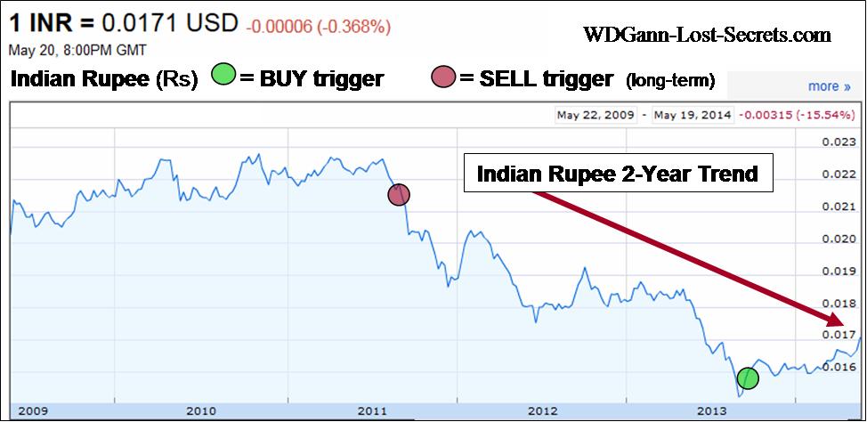 Now, let’s observe the last chart in our series now to see where we’re coming from up to the present.
The long-term momentum has been Down these last 2-years, but, the momentum has been slowing by shifting gradually upwards in price.
We’re getting quite close to a second break-out to the upside which would be a very early indicator of a long-term build-up for the Rupee.
What you’ve seen here and in the markets covered this week is how each nation’s markets can be accurately assessed and acted on early.
Understanding & finding these shifts without the special insights needed to do so can be almost impossibly difficult.
That is, unless one has a method of market analysis that can uncover these critical shifts in momentum even as they’re happening. Those critical early decision points are what’s illustrated on these charts with the red and green circles. See lower on the page to learn more about the Excalibur Method used on these charts. – George
NOTE that all charts show hypothetical decision points as part of this website’s educational content. All trading is risky. Please read the Disclaimers on this site.
![]()
Brazilian-Russian Stock Market Linkage Trends
THE BRAZILIAN – RUSSIAN STOCK MARKET LINKAGE
By G. R. Harrison (2014)
Charts courtesy of Yahoo Finance
Click on chart to enlarge for clarity
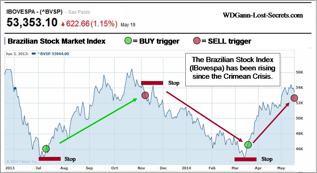
Brazil, another one of the BRIC countries (Brazil, Russia, India, China) is now up for examination.
We’re looking only at the Brazilian Stock Market (IBovespa) at this time.
The stock market bottom for Brazilian Stocks is amazing in it’s exact synchronization with Russia’s Stock Market as previously examined in our article and charts yesterday.
But, Brazil didn’t have ‘sanctions’ leveled against it, yet it also, like the Russian Stock Market declined first, made the same date bottom and has been rising since that bottom in lock-step with Russia.
Brazilian stocks have, on average, made gains of 20% since their Lows while Russia’s stock market has gained 10% in the same time period.
The similarity of two markets so widely separated by their politics and world attentions tracking the same financial paths gives pause for reflection.
This is a good example of politics being used as a smokescreen for grander financial plans by powerful interests.
While the ‘news’ misdirects like a good magician, the profitable markets-of-opportunity are scooped up for quick profits before the rest of the world knows what happened.
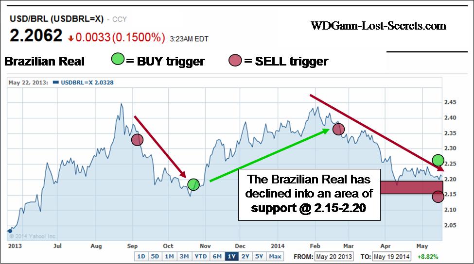 To get a broader view, I’ve included a currency chart for the Brazilian Real.
The REAL, like the Russian Ruble, has also been declining in value.
Presently, it’s showing support in the 2.15-2.20 area.
Should prices rise to hit the green circle price area, then, a new uptrend will likely engage and push the REAL upwards.
If prices drop to the lower red circle area, then support has failed and a renewed downward movement is highly likely which could drive the REAL to declines of .20-.25.
The daily and intradaily movements of currencies and stocks easily mask the true intentions of the main players from the general public. That’s exactly what they’re designed to do; leave average investors confused and hesitant.
That is, unless one has a method of market analysis that can uncover such grand strategies as they’re being implemented. Those critical early decision points are what’s illustrated on these charts with the red and green circles. See lower on the page to learn more about the Excalibur Method used on these charts. – George
NOTE that all charts show hypothetical decision points as part of this website’s educational content. All trading is risky. Please read the Disclaimers on this site.
![]()
Russian Ruble & Economic Trends
THE RUBLE IS STARTING TO SHOW SIGNS OF STRENGTH
By G. R. Harrison (2014)

Charts courtesy of Yahoo Finance
Click on charts to enlarge for clarity
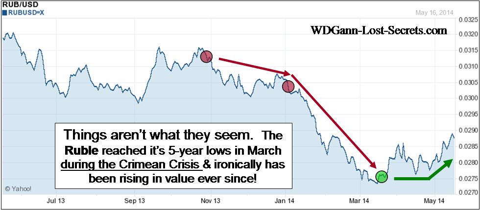
As the chart to the left shows, the Ruble has been declining since 2011 and hit 5-year lows in March of this year.
Now, 5-years is a long period of time and it essentially rolls us back to 2009 levels of valuation for the Ruble.
Low valuation levels like these are good places for a market to recover strength and the Ruble is doing that right now.
Don’t misunderstand me though, there’s still solid momentum in the downward direction for the Ruble.
It takes time and lots of buying to compensate for all the selling pressure that’s been at play over these last 3-years.
The second chart shows that there’s been significant BUYING taking place which has moved the Ruble now in the upwards direction since March 2014.
It’s interesting to note that this new rising trend started in the middle of the Crimean Crisis.
Obviously, there are some who are investing heavily by buying Russian products. If the media hype during the crisis were correct (it wasn’t), then, you’d think people would be selling their rubles and buying US Dollars. The opposite is shown on the chart.
It’s the US DOLLAR that has declined as a result of it’s admitted involvement in both the Ukraine and Crimea politically.
*Note that all charts indicate hypothetical positions using The Excalibur Method.
Currencies can reflect on immediate events temporarily as in this case, but, as I’ve advocated on this website and WD Gann did as well, it’s very, very important to know the long-term trends of the markets we’re examining.
The chart on the left shows us the shorter-term turns.
The red circles are the Excalibur Method trigger points within the downtrend of the Ruble where additional or initial positions could be placed with lower-than-normal risks of reversal.
The green circle at the bottom is where a short-term Buy trigger was indicated where a similar lower-than-normal risk could be applied.
My summary is that, despite the negative news, the smart money immediately took advantage of the political crisis to go against US proposed sanctions and started to heavily BUY the Ruble and go long the Russian Economy.
Need more proof?
Check out the behavior of the Russian Stock Market during this same crisis period.
 The chart to the left shows that both the Ruble and the Russian Stock Market bottomed at the same time, but, have since also both risen in the aftermath. Obviously big money moved into this market and has bought when things looked bleakest.
Recent European headlines show that Germany has opted out of the ‘sanctions’ approach as well as other European countries as well as Canada.
All this political posturing seems to have boosted the Russian Economy, not hurt it. Or, at least it provided opportunities to BUY at extreme discounts for those in the know.
So much for politics as an economic indicator. – George
![]()